The home insurance purchase process is a complex one with which most people aren’t very familiar. While working on Homesite’s partnership with Progressive and GEICO, these partners pushed to increase the conversion of leads they sent to Homesite’s white labeled experience. The current product configuration page was overly complex, visually cluttered and analytics data indicated it was a significant drop off point. As the lead designer on the sales platform, I created a new pathway to streamline the user flow and incorporated a feature for showing multiple rates to customers at once.
During research I conducted on the existing purchase flow, users reported unclear and confusing language and demonstrated difficulty interacting with a carousel used to display various coverage options. In addition the current product configuration page placed a high cognitive load on customers trying to navigate what is already a task they infrequently, if ever have done.
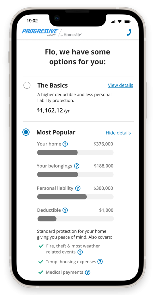
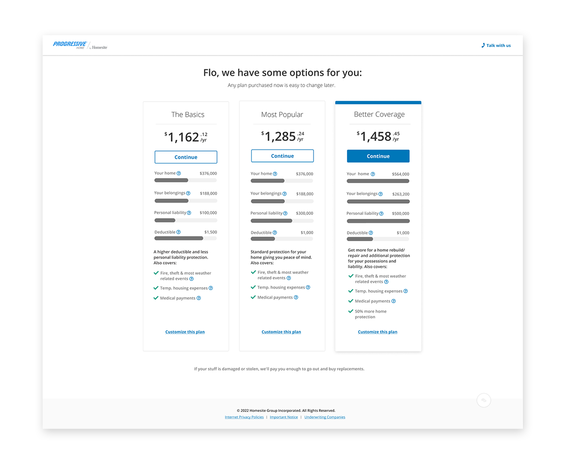
The strategy I introduced to alleviate the issues with the product configuration page was to use an upcoming Good-Better-Best pricing model to present a simplified, summary of the product prior to the complicated product configuration page. This in effect gave users an “express lane” to purchase an insurance package and enabled them to skip configuration entirely.
Most customers are pushed to one of the preconfigured packages but those with more complex needs can customize.

By offering a comparison of packages at different levels, we drew on the principles of consumer psychology to redirect the choice from purchase vs don’t purchase to which package is a better fit. It also helped focus users on which common features they valued instead of showing them every conceivable option as the product configuration page did.
After the launch of the new Good-Better-Best comparison screen, about 70% of users took the “express lane” and chose one of the pre-configured plans over customizing. Overall the introduction of the new design reduced drop off, increased sales and was touted for partners as a success. It also created breathing room to do a thoughtful redesign of the product configuration screen.