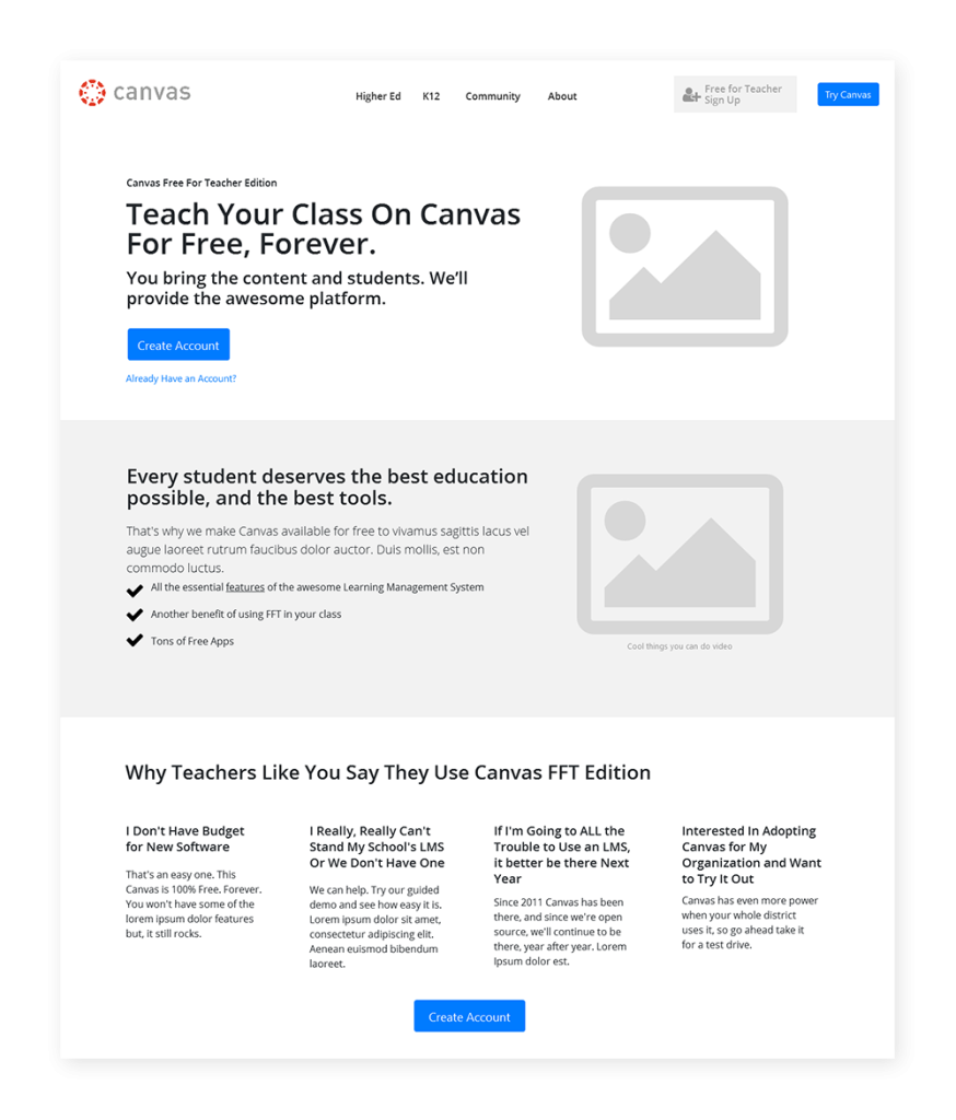
The Canvas Learning Management System (LMS) has taken the higher-education world by storm, transforming the digital classroom with modern, engaging tools and integrating with the best consumer technologies, such as Google Apps. After a failed internal attempt to execute a refreshed website for the product, the marketing team brought me in to architect the project. The savvy team of marketers, visual designers, and engineers excelled at their individual roles but didn’t have the experience to pull off a massive redesign effort for the flagship SAAS product.
Understanding the User
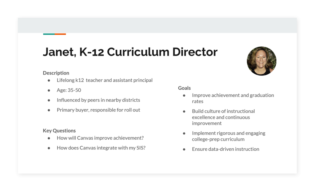
In re-envisioning the website, unchanged in years, it was critical to understand where the gaps were in how the product was perceived and what its actual benefits are. As part of the process I proposed and used, I interviewed recently on-boarded customers to understand how they viewed the product and comprehended the offering. From these sessions and existing customer profiles, I created provisional user personas. I used these personas to facilitate the prioritization of my insights, and as a collaborative tool to get the team in a more user-centered mindset.
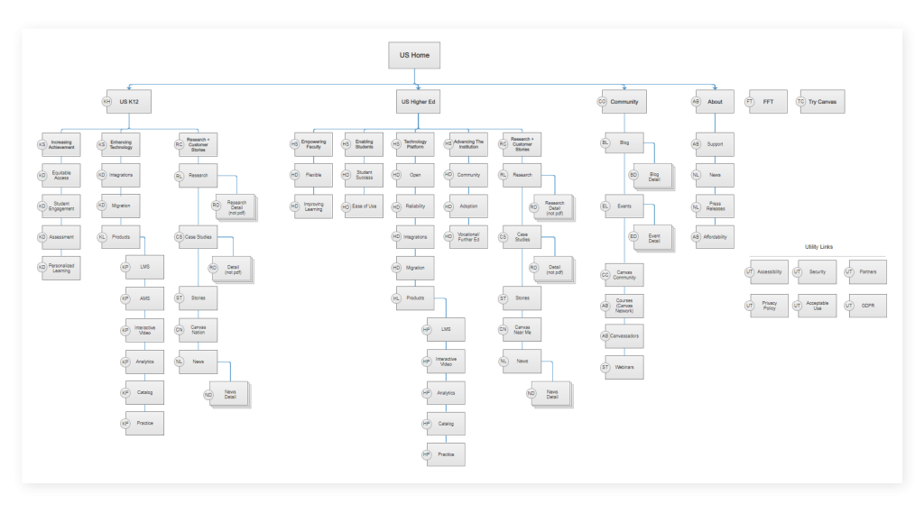
I also interviewed stakeholders to understand their business goals, but also to mine their deep industry insight into education trends and what they thought their audiences wanted. Through this phase I also performed a competitive analysis, web-analytics review, and existing content inventory. I tracked these inputs in Google Sheets and Evernote, and worked to synthesize a sitemap by sketching several options until all of the content areas were accounted for.
Key Insights
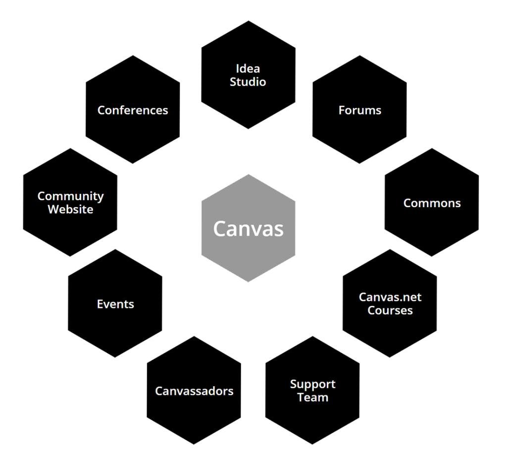
Some of the best ideas for the project came through the early conversations and interviews as new feature ideas came into my head and under promoted benefits came to light. For example: through my user interviews, it came out that the Canvas User Community was a major benefit of the product, and it was only given a small hat tip on the current site. I elevated it to be one of four primary navigation items and designed several new features around it.
Sketching the Wireframes
For any design challenge, I find it worthwhile to explore multiple ideas to see which gives a better gut reaction and which is most elegant as a design. I first created low-fidelity wireframes of several options in Axure RP, composed only of recommended broad-stroke content areas and relative priority on a page. Thus the rest of the team and marketing leadership could see the work in progress and quickly understand my strategy, and their input could be rapidly incorporated.
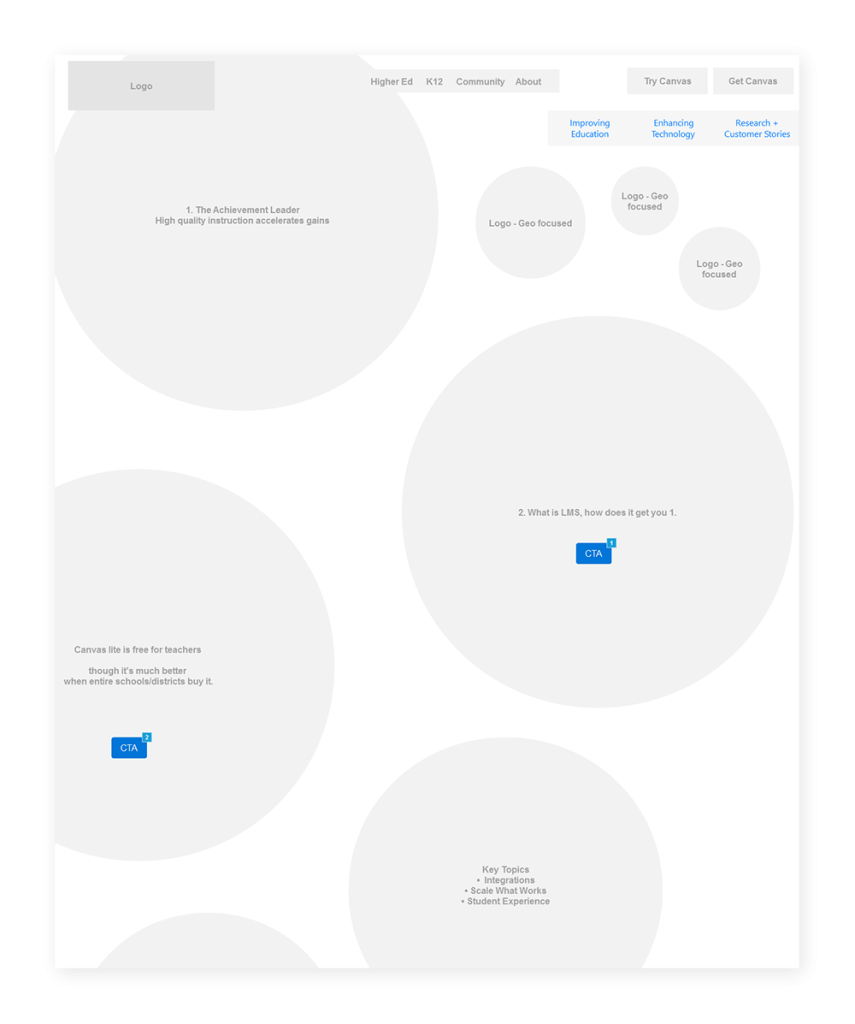
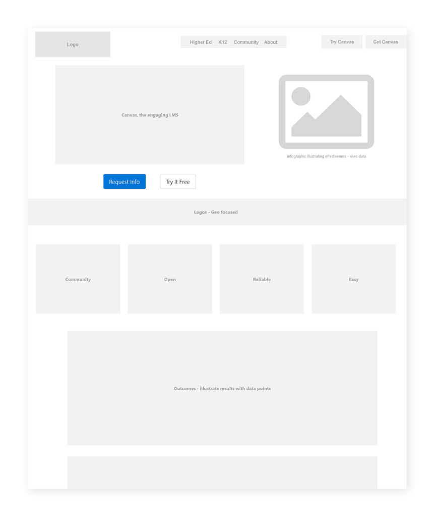
One challenge I later ran into with this approach is that it didn’t give the domain experts a good way to gauge if they would have enough to say on a specific topic. This led to some sections being longer or shorter than they needed to be. We resolved this by reorganizing some content and adding in additional related content sections and visuals, though I think next time I would break down new recommended content sections more granularly with specific subtopics.
Hi-Fi Wireframes
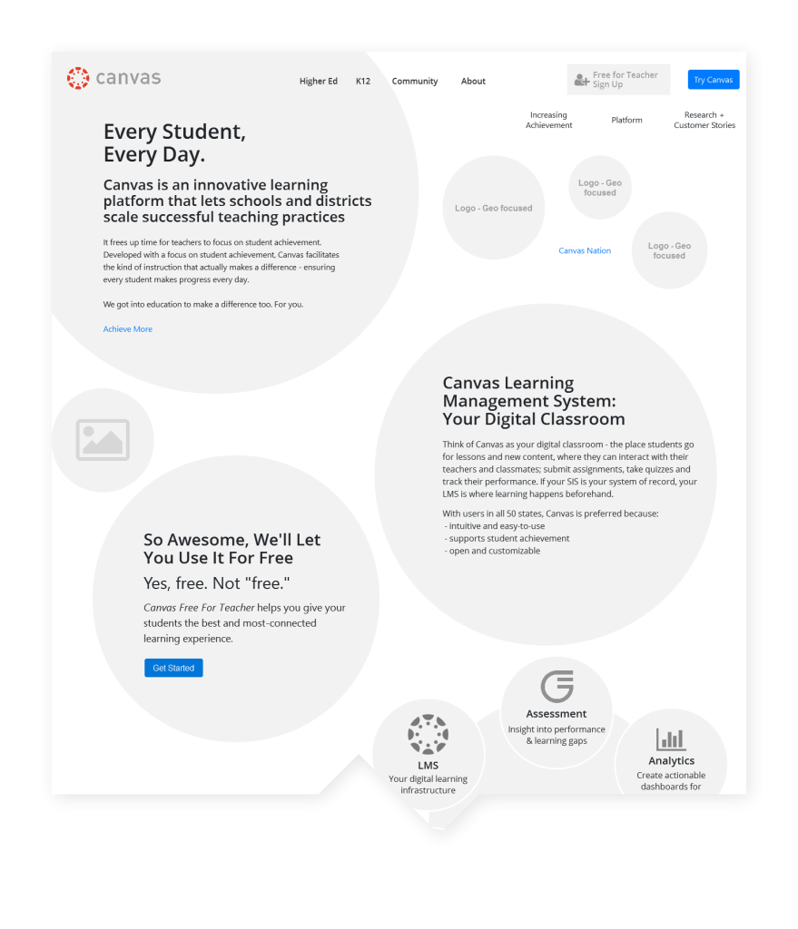
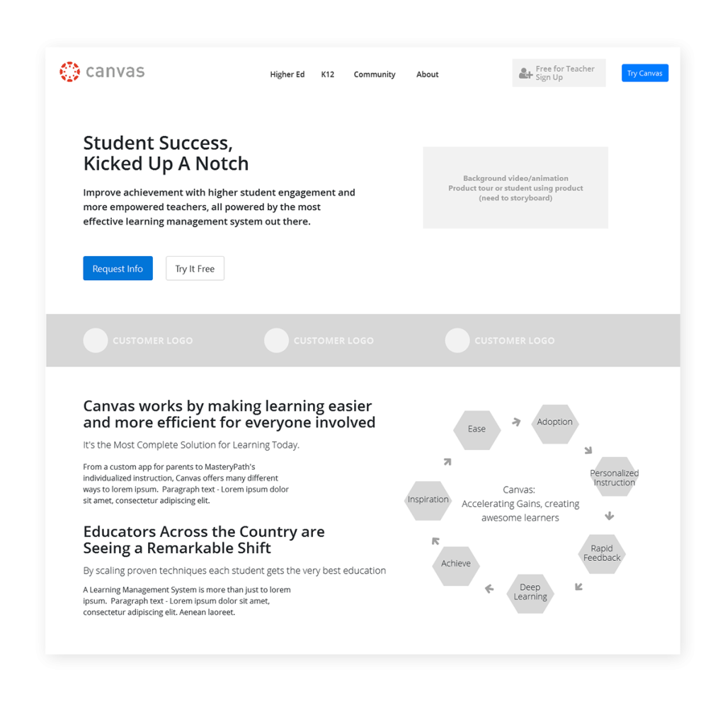
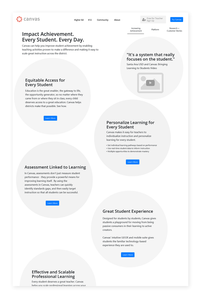
A key part of the strategy for the new site was to speak independently to the two primary audiences: higher education and K-12 school districts. As I designed the high-fidelity wireframes in Axure RP, I crafted distinct experiences for each group so that those user-specific needs could be catered to. Higher education received traditional horizontal sections and K12 used circles to lay out the page and enclose content. This visually signified different areas of the site and served as a reminder to the team to speak to each group differently and serve them the most relevant content.
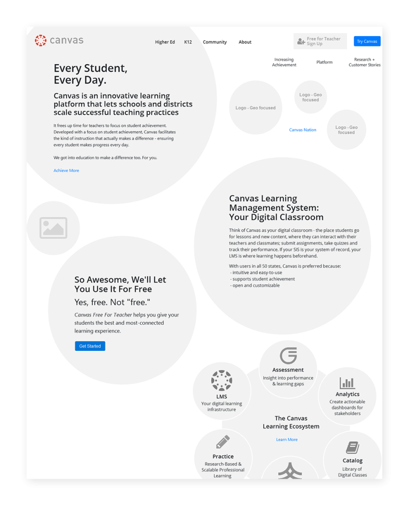
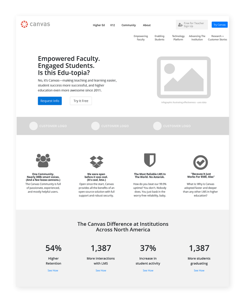
As I designed each page, I wrote unique headlines and some page content, and integrated as much real sample content as I could. This is what really makes pages resonate and enabled me to validate the design solution and illustrate the effectiveness at a very early stage.
Speaking to the Key Benefits
For the users coming to the website looking to evaluate and purchase the software, my primary hypothesis was that they would be mostly looking for how the tool would positively affect their individual and institutional priorities and not what the specific features were. To that end I designed the site around these key areas. For higher ed I spec’d pages on the openness, reliability, student success and flexibility for faculty. For K12, I led with improving student achievement, personalized learning, and student engagement. I wanted to make it painstakingly obvious that Canvas was aligned with their needs. These themes existed on the old site, but the new user-focused design doubled down on these important messages.
Validating My Work
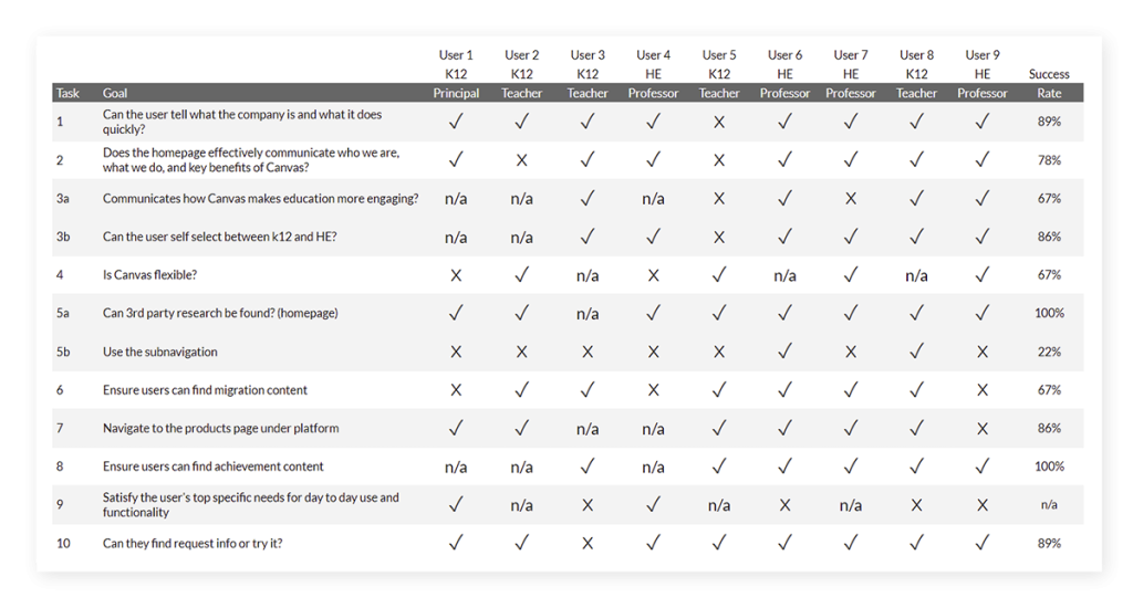
Design is mostly always a work in progress, and to make sure the decisions I made during the design process were appropriate, I pushed for and implemented a user-testing process for the marketing team at Instructure. I ran initial tests to validate the navigation and key user flows with UserTesting.com and Validately. There were no major navigation issues uncovered, but the tests surprised me in their ability to illustrate for stakeholders writing the content how they needed to alter their writing to be more web friendly and to have the appropriate level of detail for each page’s depth within the site (not as deep at the top level and more detail at the deepest level).
Making Content Visual
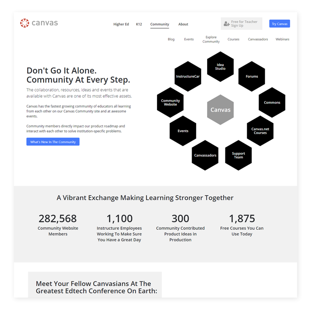
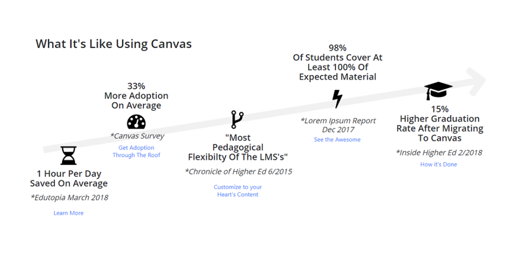
Throughout the designs, I worked to demonstrate the Canvas message in a highly visual way that could easily be skimmed and still convey meaning. In my opinion, these hybrid content/illustrations aid casual users and reinforce key points for more engaged users, strengthening the marketing effect of the page. For example, in my research it arose prominently that third-party research was very important to the audience, so that directly led to this visual, featured prominently on the homepage, that combined data and visual elements to illustrate the point.
Another example of leveraging this visual way of communicating a key point is this conceptual graphic on the community page:
Building Groundswell Endearment Through Repositioning the Product
Canvas is the educational equivalent of enterprise software: it is implemented from the top down on a large scale to a large number of users. However, it is open source and Instructure offers a free, hosted version to teachers for single-classroom use. This program was severely underrepresented on the old website and one of the core recommendations I made was to elevate this offering and rebrand it as a central service to increase product adoption at the grass-roots level. This would mean more teachers would already be aware of Canvas when evaluating a district-wide or institution-wide LMS. I positioned this offering prominently in the site hierarchy, and structured a new conversion page for it that looked and felt like a consumer-focused SAAS tool and clarified that it was in fact free for teachers.
Although this was a challenging project organizationally, due to the sheer size of Canvas’s reach, community, and features, it was incredibly rewarding. I was able to bring a tremendous amount of value by crafting a user experience that effectively communicated the product messaging and built a site that would quickly and effectively satisfy user goals. In addition, implementing a UX process in the office positioned the project for its success and established a platform for future ongoing optimization.
