next to Homesite logo
With the partner-based user acquisition strategy at Homesite, customers come from referrals to buy insurance in a co-branded experience. Each new partnership comes with unique goals, customers, and brands that the design team must incorporate into Homesite’s sales and servicing platforms. I was the designer responsible for the newly minted partnership with Zillow and collaborated with their product manager and designer to create a customized experience for them on our platform.
Zillow wanted to use a crawl-walk-run approach to launch the partnership, starting with renters who lease through their platform. From there, they would ramp up the traffic directed to our platform and then expand to larger audiences of prospective renters and homeowners. Zillow used this strategy to test the optimal points in their funnel for referring users to us, allowing both teams to work together on optimizing conversion rates.
Maintaining trust across brands
We began with a flow offering renters insurance to users after they completed a lease agreement form, guiding them from Zillow’s renter portal to our co-branded site. This would be a high-probability sale, as renters insurance is required by most landlords. To best ease users’ minds on the bridge from Zillow to Homesite, the new experience needed to suitably introduce the Homesite brand.
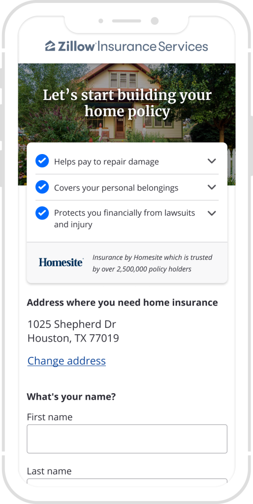
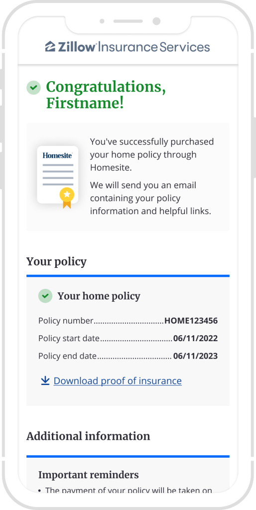
Zillow required this introduction to clearly specify that the product would be underwritten and serviced by Homesite. To accomplish this, the new landing page I designed featured a small Homesite logo along with trust-inspiring brand messaging that I had successfully tested with another partner. As the user moves through the flow, the Homesite branding becomes more prominent. On the post-purchase page, I added a graphic with a physical representation of a Homesite policy to give the user a sense of accomplishment and fulfillment with their purchase.
Streamlining user inputs
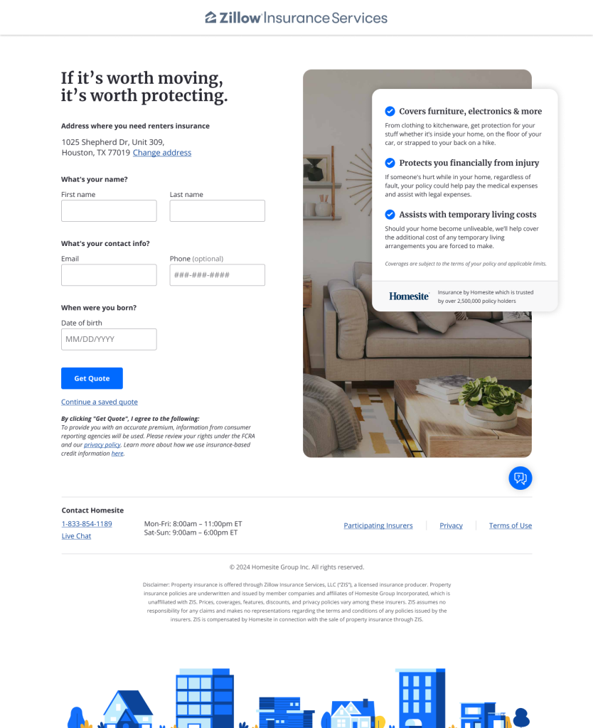
The next step in the crawl-walk-run strategy was to launch the flow for homeowners insurance, which is a more complex product at a higher price point. On this landing page and the renters insurance landing page, I designed a new pre fill address information section as its own compact element. Typically, this data would be shown using input fields, but by presenting it as text with the option to edit it in the edge case users needed to change it, we were able to avoid overwhelming users with too many editable fields.
Embedding inside Zillow’s experience
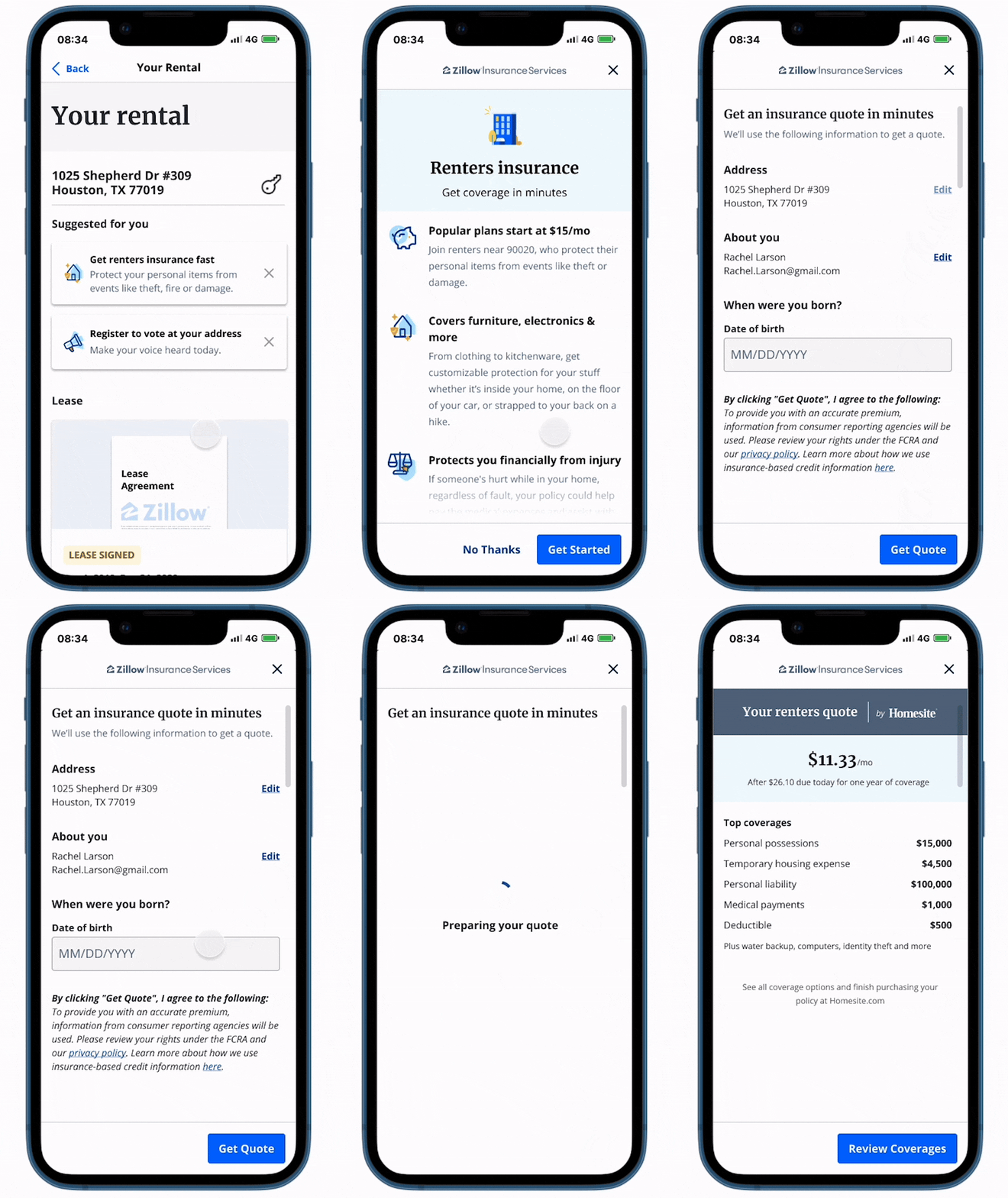
In addition to testing offers at different points in their funnel, Zillow wanted an experience in which users could obtain a quote directly from their website. I designed an embedded module where our flow would leverage Zillow’s Constellation design system to match the look and feel of their site when customers interact with Homesite’s quoting engine. The module would appear fully integrated when inserted anywhere within Zillow’s experiences to offer users a more engaging way to get a personalized quote without having to leave the app. By creating a high-fidelity prototype, I was able to validate its usability through user testing sessions and assure Zillow that the solution would positively complement their app.
Optimizing conversions from the embedded module
Once the embedded module had been launched and we began collecting data, it was not performing as well as the non-embedded flows. Zillow asked us to examine the performance and suggest enhancements. Working with one of our analysts, I identified several points of increased drop-off that stood out from other flows. I brought up an earlier concept we had shared that offered two pathways to purchase: a prepackaged plan with the most common options or a customizable package. I recommended making the prepackaged plan the default option instead of showing users the customization screen because 64% of users had opted for the inexpensive prepackaged plan.
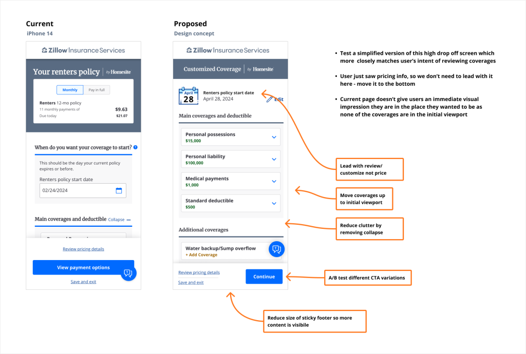
By allowing users to quickly obtain the basic package with one less screen to click through, I hypothesized that conversion rates would improve and be closer to the baseline. With my analysis, I identified another high drop-off point and recommended a series of improvements to our product customization screen. For example, by designing a more concise start-date selection component, I was able to show content that was much more relevant for a user expecting to customize their policy options.
My user experience and design enhancements led to a 32% improvement in the conversion rate during a/b testing and have been adopted into the platform. By working together to deliver intuitive, evidence supported designs, I built trust with an uncompromising partner who was delighted with Homesite’s work.